Back in 2006, creating a Facebook Page was mind-numbingly simple. You picked your URL, uploaded a picture, filled out a few boxes, and that was it. Unlike its chief rival, MySpace, there was no mucking about with HTML, no picking the right animated backgrounds, no blinking green fonts to fine-tune.
Of course, the flipside of that simplicity was a complete lack of control. Your page was indistinguishable from every other. White background, Helvetica, blue buttons, a simple newsfeed-type layout.
Facebook has slowly been adding options to the mix the past few years. You still can’t create a true rotating-skull-gif masterpiece like you could on MySpace, but you can make your page more useful to your audience.
This week, Facebook began rolling out a new batch of settings for pages. These new options are aimed squarely at marketers; they’re all about converting traffic into action (and paying Facebook for more action whenever possible).
Here’s how to optimize your shiny new Facebook Page.
#1: Brush up Your Images
It’s not all “brave new world of tomorrow;” most of the changes are far enough under the hood that your casual traffic won’t notice them. Your trusty profile and cover photos are still the first thing people see:
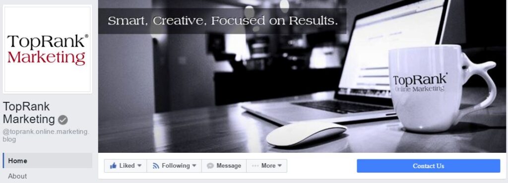 So now is a good time to give both images a once-over. Are they visually compelling? Are they the right size and resolution? Make sure you’re putting your best face forward. Your profile picture should be square, 170×170 pixels. The cover photo should be 851×315 pixels. Use a JPG for the cover photo if it has lots of color depth. For photos with large flat areas of color or lots of text, use PNG instead.
If your images look good and your CTA button is ready to for action, you can start organizing your page.
#2: Choose a Template
First, head to the “Settings” button at the top of your screen. Then select “Edit Page”:
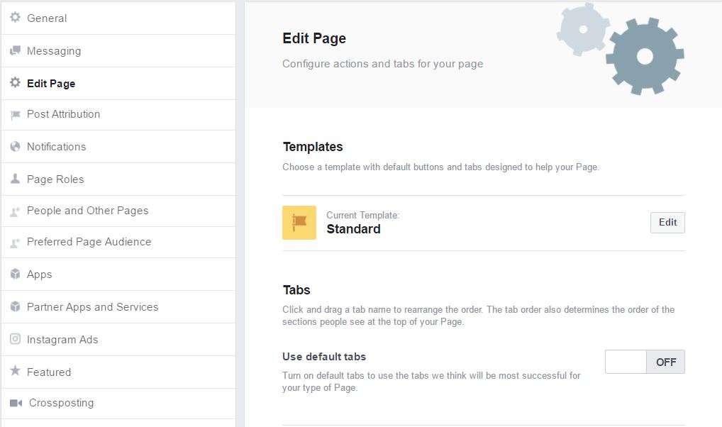
Here’s where you can drill down into how your page looks to your potential audience. Start by having a look at the types of templates available. If you’re in a few very specific industries, Facebook has you covered for a preset look:
- Shopping is for ecommerce sites. It highlights your products and encourages people to buy
- Venues puts the focus on your upcoming events, hours, and location
- Gaming highlights your fans, with a tab for Groups where fans can connect.
- Politician encourages people to send messages, and features photos and videos your page shares
- Professional Services has a “Call Now” CTA and puts your Services tab up at the top of the list
- Restaurants & Cafés is designed to highlight your hours of operation, location and menu
Each of these templates automatically rearranges your tabs and buttons. Before you choose one, take a look at the details to see which tabs are featured—if you pick a template that’s missing some of your current tabs, those tabs will disappear.
In the incredibly likely event that your industry doesn’t fit neatly into one of these six templates, you can…
#3: Rearrange Your Tabs (And Your Feed)
Your page has a row of tabs on the left side that people can click to go straight to specific types of content.
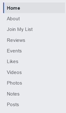
This is where you can make a huge difference in how your page looks and feels. In the new layout, the order of your tabs top to bottom determines the order content is displayed on your page.
In other words: If you put the Photos tab at the top of the list, your latest pics will show right under your profile picture. If you put Events up top, visitors will see the event and your “Buy Tickets” CTA button first. You don’t have to pin one post and hope for the best! You can show viewers exactly what you want them to see! O, frabjous day.
Put your most relevant content types at the top, and turn off tabs you don’t need:
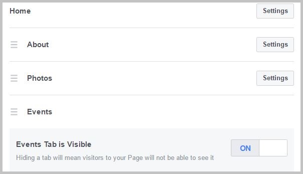
Make sure your most visible content will lead to the action that’s most valuable to your goals. If you’re raising awareness, photos or videos might be the top. If you’re keeping your audience up to date on news, keep your posts up top, etc.
Note that Facebook will sometimes add a “Featured for You” box at the top of the feed for individual visitors, with content its almighty algorithms determined will be of most interest.
#4: Take Advantage of the New Posting Templates
The final change you will notice is a row of colorful boxes underneath your usual “Write something” post prompt:
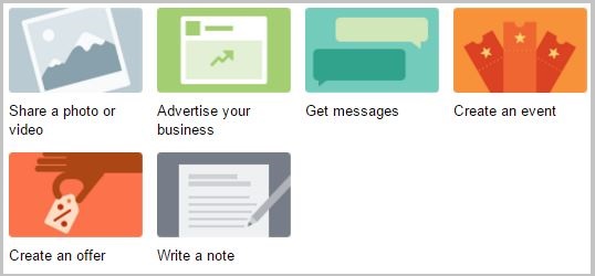
This is Facebook’s less-than-subtle way of clueing us into new post templates(and, of course, subtly encouraging specific types of posts). Each icon leads to a custom form you can fill out to quickly create ads, invite discussion, create events, and more.
If none of the templates is appealing, just click in the “Write something” box to write a plain ol’ post, just like grandpa and grandma used to write.
#5: See the Final Results
Once you’re done customizing and adding new content, take a look at what your page looks like to visitors. Your view is full of buttons, tips and tools to help you funnel advertising cash to Facebook. If you log out completely, you can look at the page as a visitor—but the bottom half of the screen will have a big “Sign Up or Log In” banner.
It can take some clicking around to find the “View as Visitor” option—it’s hiding in the “More” button just below your profile picture:
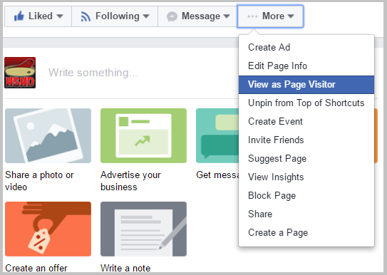
Take a minute to look around and make sure your page is looking its best.
Give Your Facebook a Facelift
Even with these changes, Facebook Pages will never be confused with a properly-optimized, well-designed landing page. Still, you can exercise a lot more control now over how your audience encounters and interacts with your page.
So brush up your images, get your tabs in order—and most importantly, keep serving up quality content that will help you build an audience.
Need more social media tips? Check out or most popular social media marketing posts of the year.


